#02 Buildings of Wonder?
Share this article:
 Another photo from the 365 day photo challenge to provoke ideas:
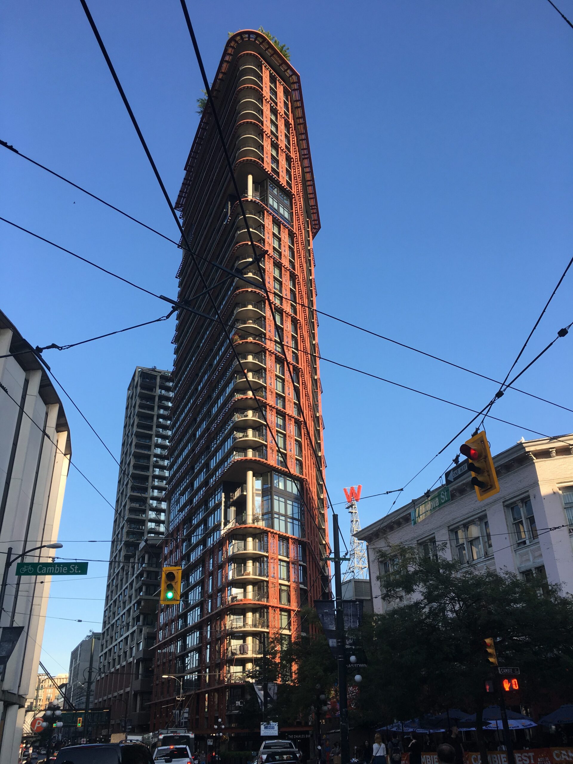
It’s a photo of a beautiful building in Vancouver. We saw it on the edge of the Gastown District when we visited last year. Distinctive and visual, in a district where many of the high-rise buildings have gardens and trees on the roof.
Some questions:
What are these places like to live in? Have we moved beyond the times when the work of architects and designers may have looked stunning, but often created works of beauty that were a nightmare to live in?
How does the designer in any context of life make sure that the end-user gets something that they can enjoy and flourish in?
Do these issues apply to virtual worlds too? What about app developers? How do they make sure that their products are easy to use and don’t irritate the end-user?
Are there situations where annoying the end-user is the point? For example, should the artist making an installation set out to deliberately provoke, and therefore they may not be looking for an entirely pleasant reaction? In music sometimes, the desired intent is not beauty but ugliness, starkness and darkness. Is this also an example where wonder and beauty might not be the goal?
The world would be a bland place if all we looked for was the positive, the beautiful and the enjoyable. Sometimes we need negative, ugly and uncomfortable to understand their opposites. Light and dark, colour and monotone. A world rich in variety, where sometimes the things that we find stay with us and have an enduring appeal might not be the instantly and obviously impressive.
Also published on Medium.

2 thoughts on “#02 Buildings of Wonder?”
I’m not sure but I think you could be right
Wow. I thought it was the Flat Iron Building in NY. Is it same architect?